Friday, September 25, 2009
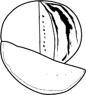
while making my wector trace and freehand artwork, my biggest concern was making sure the illustration looked 3D and not simply a divided curve. on the vector trace i used variety of line thicknesses and textures to enhance the beliveablity of the 3D shape, i used similar but less intensive processes on the sketch version.in coulor formats iwent with one normal and one abnormal colour scheme, normal on the trace for beliveability and a more pop art look on the sketch freehand because it went with the over all style of the design.
Thursday, September 24, 2009
Monday, September 14, 2009
Subscribe to:
Comments (Atom)


